

Results 1 to 15 of 116
Thread: Rendering Critique
-
05-11-2006, 06:23 PM #1
 aka Adam
- Join Date
- Aug 2002
- Location
- Indianapolis, IN, USA
- Posts
- 1,813
Rendering Critique
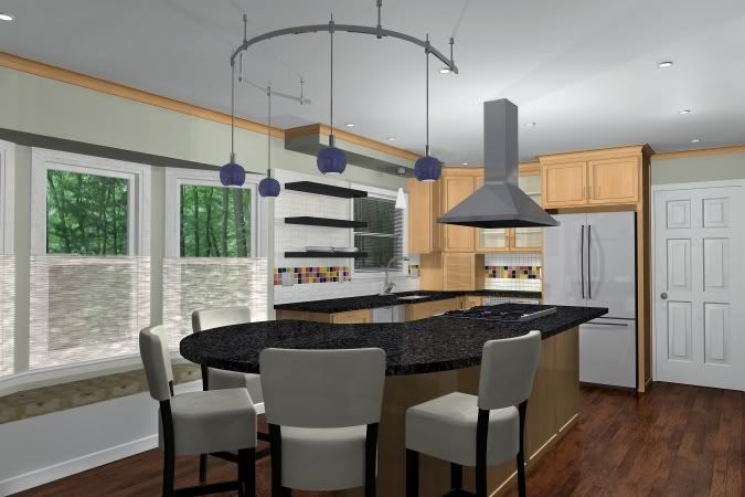
This is the rendering to coincide with photos for the next issue of BH&G Kitchen Makeovers cover story. Constructive criticism is welcome, as I'd like to make it more photo realistic. The stools are the Brightons that John created. Thanks!
And the photo:

Last edited by alobartn; 05-22-2006 at 05:19 AM.
Adam Gibson, CKD, CBD
Indianapolis, IN, USA
Chief X6
-
05-12-2006, 12:47 AM #2
Always learning
- Join Date
- Nov 2005
- Location
- Adelaide, Australia
- Posts
- 733
Adam
On the picture quality:
Some sections, such as door, glass cabinets and around shelves appear too bright. it may be the material properties, and it may be the lights. The cabinets appear to be too reflective.
I would make teh ceiling more "emissive" and the crown molding white.
The Kitchen looks nice, and aspects of it remind me of my own. Like my own kitchen, it could do with a bit more food preparation area around the sink.
I know you are working with restrictions of existing space.
The walls seem to have a "mossy green" tinge to them, which I like and would even give the wall colour more emphasis.
"Whateveritis" in front of the windows will need some adjustment.
You asked for comments.
Make the most of the magazine exposure and remember to have fun.Peter Sveinsson
Bathroom Designer, Kitchen Designer, Builder
Adelaide, Australia
email: peter@brilliantsa.com.au
email: (alternative) icy@senet.com.au
Website: www.brilliantsa.com.au
X4 on Windows 7
-
05-12-2006, 02:16 AM #3
Registered User Promoted
- Join Date
- Apr 2006
- Location
- Queensland, Australia
- Posts
- 100
Looks good but a few things that come to mind:
The bright blue of the lights doesn't suit the rest of it. I'd use a longer and more subdued light shade - the fixture itself is good though. Maybe brushed aluminium or chrome to complement the stove hood.
Halogen downlights should be used as task lights - they're misused as general lighting although I know lots of people do it.
I agree the cabinets and door are too washed out but I like the ceiling and the colour for the crown molding (aka. cornice).
The flooring is a bit rustic looking for the rest - the contrasting colour is good but maybe use a flatter texture.
Good luck with it.Andrew Webb
-
05-12-2006, 03:13 AM #4
Registered User Promoted
- Join Date
- Dec 1999
- Location
- Media,PA, USA
- Posts
- 3,308
Adam,
I agree with the others points. ALso, what is the texture on the window seat?? looks odd to me. I would also raise trhe camera level and tilt it down a touch to get a more complete view.Dennis Gavin CR, CKBR
Gavin Design-Build
Media, PA.
610-353-8890
X5
-
05-12-2006, 03:54 AM #5
COUNTRY BOY
- Join Date
- Dec 2003
- Location
- walterboro,sc 29488
- Posts
- 784
rendering
adam, looks good but floorand curtains
 HARRY B STANFIELD JR
101 alvin st.
walterboro,sc 29488
S&B REMODELING
843-549-2674
843-908-1143--MOBILE
harrythebuilder@yahoo.com
http://photobucket.com/albums/b335/HARRYBSTANFIELDJR/
VER: 10.08A
-
05-12-2006, 04:36 AM #6
aka Adam
- Join Date
- Aug 2002
- Location
- Indianapolis, IN, USA
- Posts
- 1,813
Thanks already for the critique. I should have said, the kitchen is finished. I'm looking not for design critique but for rendering suggestions. I've put what I have, a blow up of a Polaroid, up at my first post, along with a rendering with some floor reflection. Sorry for the confusion.
Adam Gibson, CKD, CBD
Indianapolis, IN, USA
Chief X6
-
05-12-2006, 05:05 AM #7
COUNTRY BOY
- Join Date
- Dec 2003
- Location
- walterboro,sc 29488
- Posts
- 784
now adam, that pic looks great
HARRY B STANFIELD JR
101 alvin st.
walterboro,sc 29488
S&B REMODELING
843-549-2674
843-908-1143--MOBILE
harrythebuilder@yahoo.com
http://photobucket.com/albums/b335/HARRYBSTANFIELDJR/
VER: 10.08A
-
05-12-2006, 06:39 AM #8
Registered User Promoted
- Join Date
- Aug 1999
- Location
- Ridgway, Colorado, USA
- Posts
- 2,917
I would try a lower light level, as suggested.
The glass in the cabinet doors is way too reflective. Add transparency.
I would also play with the material settings for the stainless steel. Add some reflectivity.
The lower shades at the windows could be translucent just like the photo.
The counter could be more reflective. In the photo you can see the reflection of the plants.Larry
Lawrence C. Kumpost, Architect
No matter how much you push the envelope, it'll still be
stationery.
-
05-12-2006, 07:06 AM #9
3D Symbols creator
- Join Date
- Oct 2002
- Location
- Nordmaling, Sweden
- Posts
- 845
Hi Adam.
My 2 cents.
Choose a little less yellow texture for the cabinet doors.
A little darker floor with a little reflection
Change the texture for the fridge.
Turn down the light a little, maybe take away show reflections on some of the lights.
You can do a few adjustments in a photo software but you have to have the original to get a good result.
I made some quick adjustments but you can tweak it much more.

Take care.LAN Web-Atelier
Lars "Anders" Niemi
Nickname: Night
Drottninggatan 4
Nordmaling - Sweden
Tel: +46 72 211 9077
support@lanwebatellier.com
Homepage
http://www.lanwebatelier.com
Picture page showing many of my symbols.
http://photobucket.com/albums/v698/night8917/
-
05-12-2006, 07:31 AM #10
Trifoil Arch Villain
- Join Date
- Feb 2003
- Location
- Bovey, MN
- Posts
- 3,507
In the actual photo a lot of the light comes in from outside. I'd try to do more of that in the rendering.
-
05-12-2006, 07:53 AM #11
Registered User Promoted
- Join Date
- Oct 2003
- Location
- Bobcaygeon, Ontario, Can
- Posts
- 1,079
Adam, - I am not experienced enough to help with the raytrace settings but I have adjusted your kitchen in Photoshop. It is nice kitchen and the stools look great. Thanks again to John. I do prefer the more cone-shaped, elongated lights in the actual photo and I would make them more a plum or purple colour. They are in the foreground and so are important.
Last edited by George Godwin; 05-12-2006 at 08:07 AM.
ggodwin
-
05-12-2006, 07:59 AM #12
Registered User Promoted
- Join Date
- Nov 2004
- Location
- Harrisburg, PA
- Posts
- 570
Your raytrace looks great.
to make it more "real" I might try to.....
- Soften the textures of the fabrics (shininess & emmisiveness I believe) so that they reflect little to no light and absorb it instead (as they would in real life).
- Dull the cabinet finish possibly and make the glass doors a bit less emmisive and more transparent....so there isn't so much glare....
- use more ambient lighting (from outside) - turn off the lights inside, or make them really dim.
- make those pendants less "electric" blue...they look like cartoon lights in a roger rabbit world.

- Dont make the floor reflective - as the floor would be "used" and "worn" in reality
- definately soften the edges & shadows to the maximum when raytracing...don't use a real high radiosity though.
- and lastly - put a couple more kitchen items on the counters & shelves - even some produce maybe. a more "still life photo" finish.
Just my thoughts.
Last edited by custer; 05-12-2006 at 08:05 AM.
CA User since 1997.
Current: V10, X1, X2
-
05-12-2006, 11:47 AM #13
Registered User Promoted
- Join Date
- May 2005
- Location
- Mannheim, Ontario, Canada
- Posts
- 100
George
What tools did you use in Photoshop to get those results you posted in the last pic? The doctored pic appears more realistic than the initial rendering. I have always had a difficult time getting my renderings to look 'real' insted of computer generated. I know I could tweak the textures in Chief, however it looks like you have good results by using Photoshop.
JimJim Gerrard
Gerrard's Design & Drafting Inc.
CA ver. X2, Vista
-
05-12-2006, 02:52 PM #14
Registered User Promoted
- Join Date
- Oct 2003
- Location
- Bobcaygeon, Ontario, Can
- Posts
- 1,079
Jim, - I use a lot of tools and I select certain areas for specific treatment. Some of the key tools are Image/Adjustments/Levels and Image/Adjustments/Hue Saturation Lightness.
Levels allows adjustment of bright, medium or darker tone levels. It is more versatile and refined than the Brightness/Contrast adjustment. Saturation allows colours to be richer (saturated) or, in the alternative, desaturated for the effect Anders shows. Hue allows colour shifts and Lightness speaks for itself.
I also use a lot of Layer Blending modes like Multiply, Colour, Overlay, and sometimes Screen for specific areas and I use a lot of Layer Masking to deal with specific items. These are the main tools.
To get the outdoors to show through the screening material over the windows I copied the upper portion of the outdoors onto its own Layer, moved it over the screens and used Edit/Transform/Distort to adjust the shape and opacity with a mask for finer adjustments. Opacity adjustments are used a lot on layers together with Layer Masks.
I added grey to the glass upper cabinet door and simulated shelves (lines with blurring) as well as grey to the fridge. A Gradient Fill on the fridge might have been more realistic with masking and using a blending mode.
I use the Filter/Blur tools to blur the edges of the shadows and the highlights and any shortfall of the anti-aliasing to smooth sharp or provocative edges where needed.
Once you have the colour and light/shadow tones close to what you think looks real (if not a little rich in colour saturation) you can adjust the overall image with a little Filter/Sharpen/Unsharp Mask and perhaps a delicate tweak of the Image/Adjustments/Brightness/Contrast to taste. You can pour a glass of wine at this point and survey your results.
In the end, you have to review your image carefully to see if the colours look real (if not a tad rich or saturated), check for sharp edges that should be softened with Blur, and assess whether the tonal range of lighting and colour overall is realistic and as 'even' as desired.
Interior renders in Chief often have large shifts in brightness over the lighting range that have to be compensated for by various adjustments. Strong local lighting tends to wash out colours and make them too bright. The shadow areas in turn are too dark and detail is lost. Most of these items can be successfully adjusted in an image program.Last edited by George Godwin; 05-12-2006 at 03:01 PM.
ggodwin
-
05-12-2006, 03:25 PM #15
Registered User Promoted
- Join Date
- Oct 2003
- Location
- Bobcaygeon, Ontario, Can
- Posts
- 1,079
Kitchen with Maid
Oh and by the way, if you can afford Champagne instead of wine, go for it. And better still, if you can afford to hire a Maid for those special occasions, even better.
In this image, I changed the lights hanging over the counter to cone shapes and added rays. This was done simply by projecting some white lines down from the lights on a new layer and blurring them with Gaussian Blur. This also puts some highlights on the counter below the lights. The effects are subtle and easy to adjust using layer Opacity levels.
Last edited by George Godwin; 05-14-2006 at 06:13 PM.
ggodwin


 Reply With Quote